The Catalogue
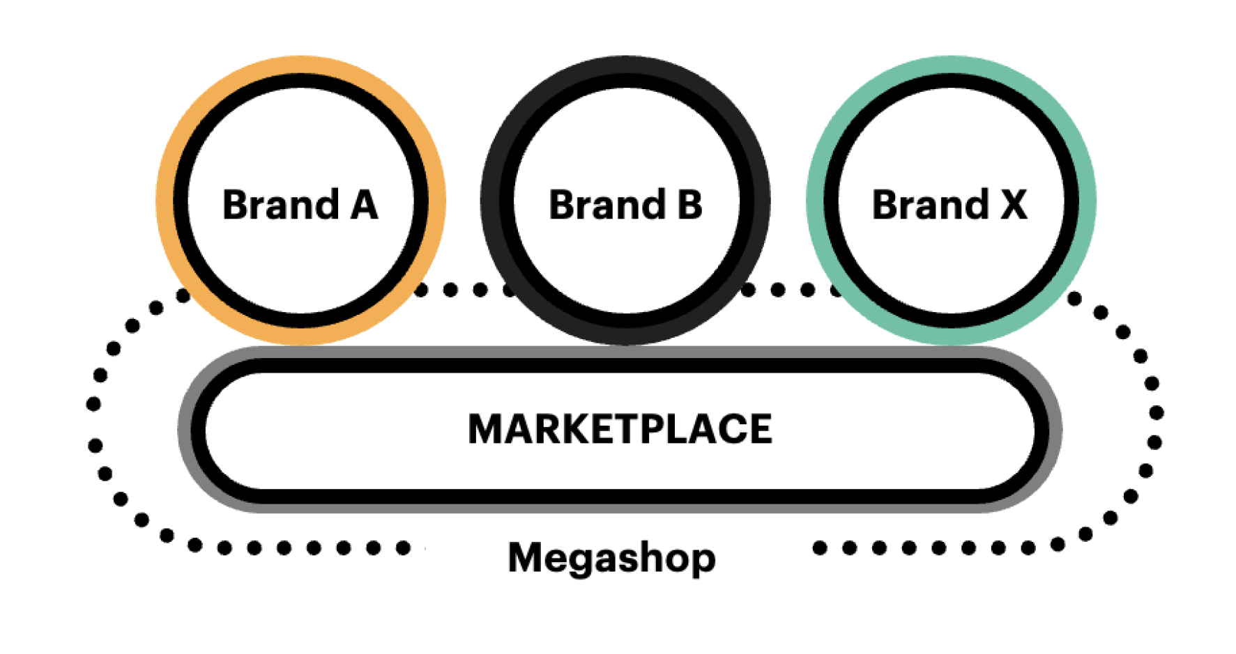
Launch a new online marketplace, driven by expert advice
Stakeholder Workshops Competitive Analysis Customer Research High Fidelity Prototype Usability Testing High Fidelity Wireframes Product Design Kit Service Blueprint
Activities involved
Who’s the client
Major Player in Media Industry
What
Responsive Web Design
My role
Designer
Category
eCommerce, Retail
Teamed up with
4 x Designers
When
Nov 2021 - March 2022
The Opportunity
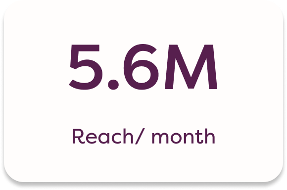
The client has strong storytelling, advice and reach to customers.
They are uniquely placed to offer customers with eCommerce experience.
The Goal
Build an MVP marketplace for one masthead to sell selected product categories by June 2021.
Stakeholder Workshop
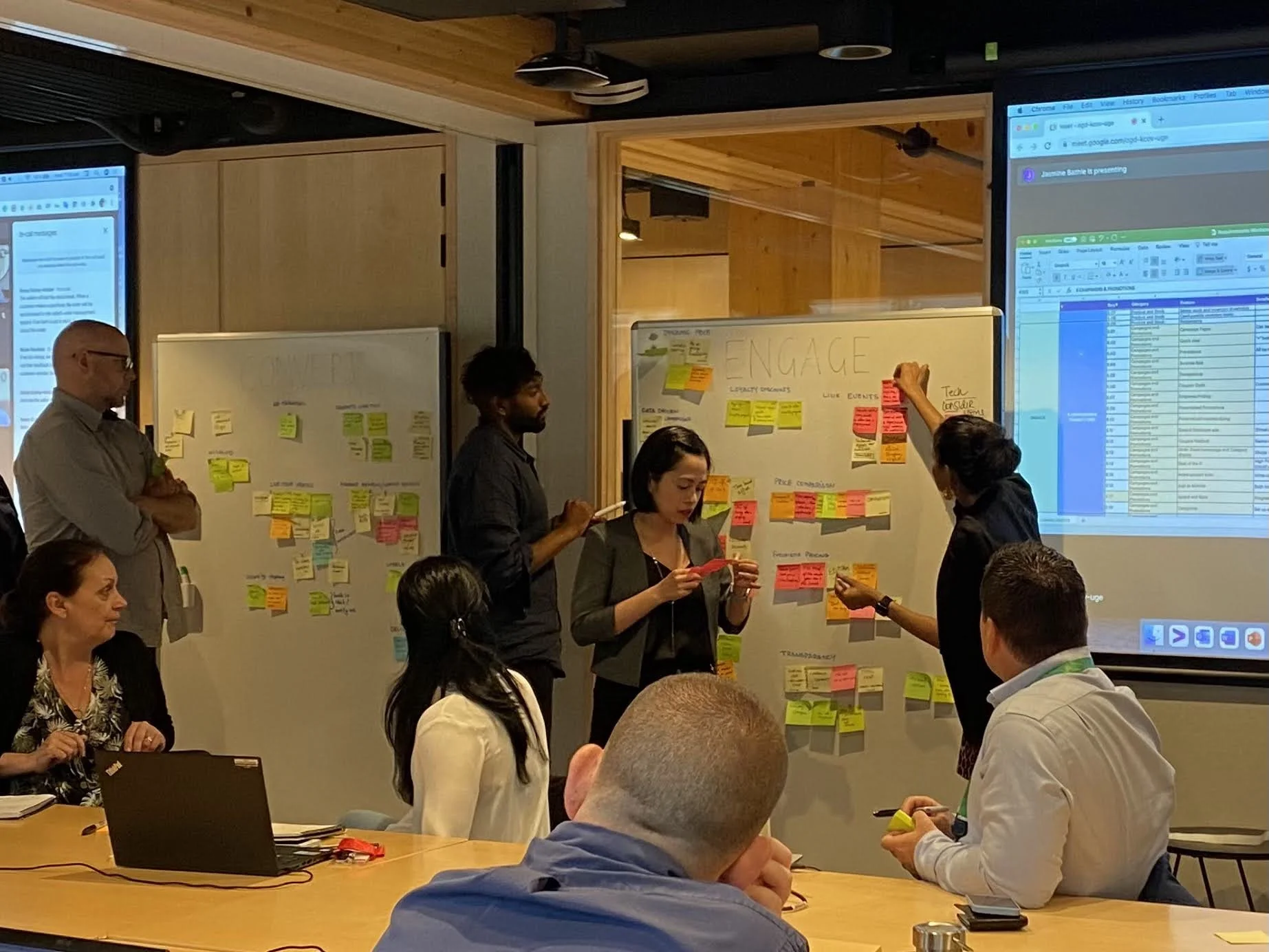
We ran stakeholder workshops to understand the vision, background and boundaries of our goal.
A lot of questions were discussed
What is the primary aim of this experience?
Who is our target audience? What is the brand and tone for the product and testing?
Who are our competitors?
What are the technical boundaries?
What do we think won’t work?
What should the target experience be aimed towards?
What are the gaps?
Competitive Analysis
I analysed the 14 eCommerce and content sites - looking both at the shopping experience and common interactions to find patterns.
Customer Research
Working with a research team, we used secondary research and survey methods to understand Australians’ shopping behaviour. Three key themes emerged:
High Fidelity Prototype
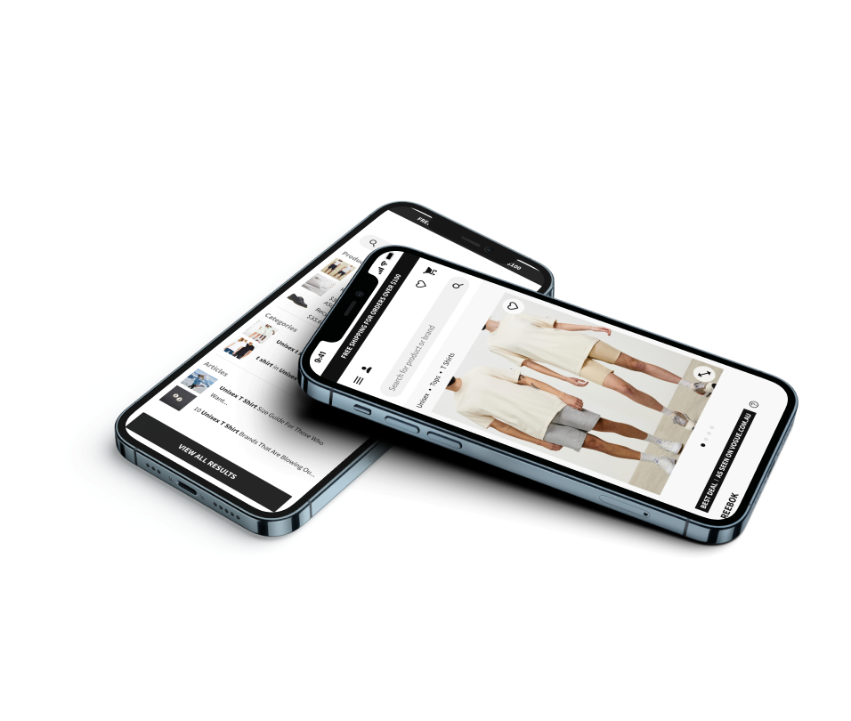
I connected the high fidelity wireframes into a clickable prototype. That allowed us to test with customers for 12hrs of usability testing. One of the prototype flows is shown here.
Prototype Validation
We validated the prototype with 12 users. Each were given a subset of the prototype dedicated to the shopping journey. I wanted to be sure that users understand found the experience easy and streamlined.
This was tested over Microsoft Teams, where I introduced the users to the website and asked them questions. The questions were mainly focused about whether the shopping journey was easy to understand.
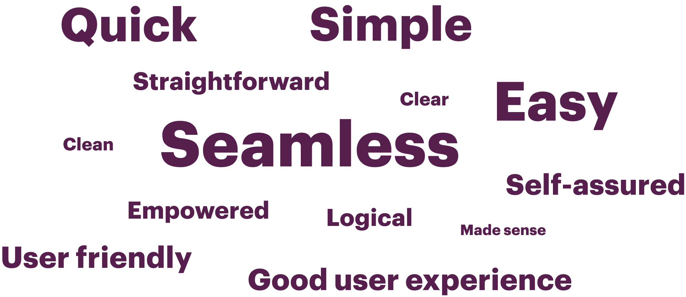
Question: How would you describe the experience?
Complexity Rating
The participants were asked to rate the overall complexity of the experience between 1 and 5. 1 being very simple and 5 being very complex.
5/6 rated it a 1 (Very simple)
1/6 rated it a 2 (Simple)
Usability Study Iterations
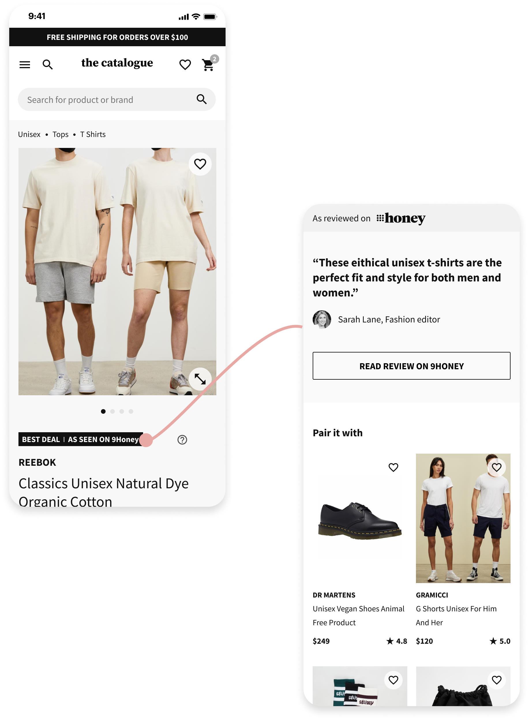
Within the product page. each product has a tag at the top, highlighting the article that it was featured within, and the value for customers (e.g. “Best Deal”). This tested very well, however our initial design didn’t have any interaction attached to the tag - and that didn’t align with customer’s expectation about learning more about the expert review when they clicked on it.
Iteration 1 - Direct to Article
Our first iteration was when customers clicked on the tag, it took them directly to the article that the product was featured in. This was the most straightforward solution, but didn’t work well in the real world, as during testing it brought customers out of the shopping experience, and negatively impacted conversion to cart.
Iteration 2 - Details within PDP
Taking onboard the feedback, we created a version which linked to a section at the bottom of the PDP, with the quote about the product, and a button which takes the customer to the original article if they wanted to. All participants understood this solution clearly, hence it was chosen as the preferred CX solution.
High Fidelity Wireframes
We then went into detailed design to address UX confusions during testing and expand into more complex journeys (refund, emails comms, blog articles etc.)
Dev ready product designs
156
Hours of customer testing
12
Reusable Figma components
82
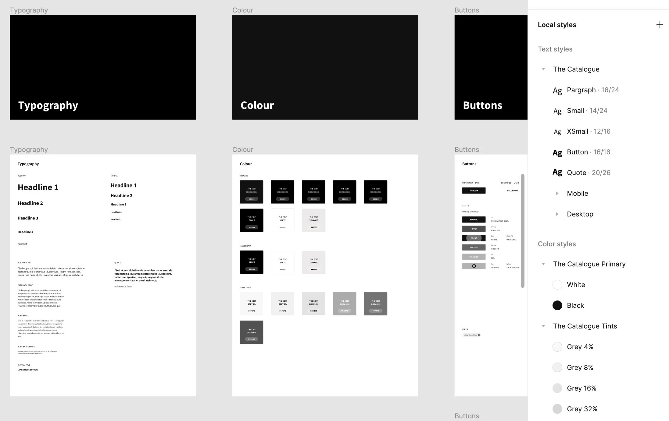
Product design kit (PDK)
With no branded icons, colours, font etc, we leveraged Figma art styles, which was swapped easily once brand direction matured. This formed the basis of the design systems.
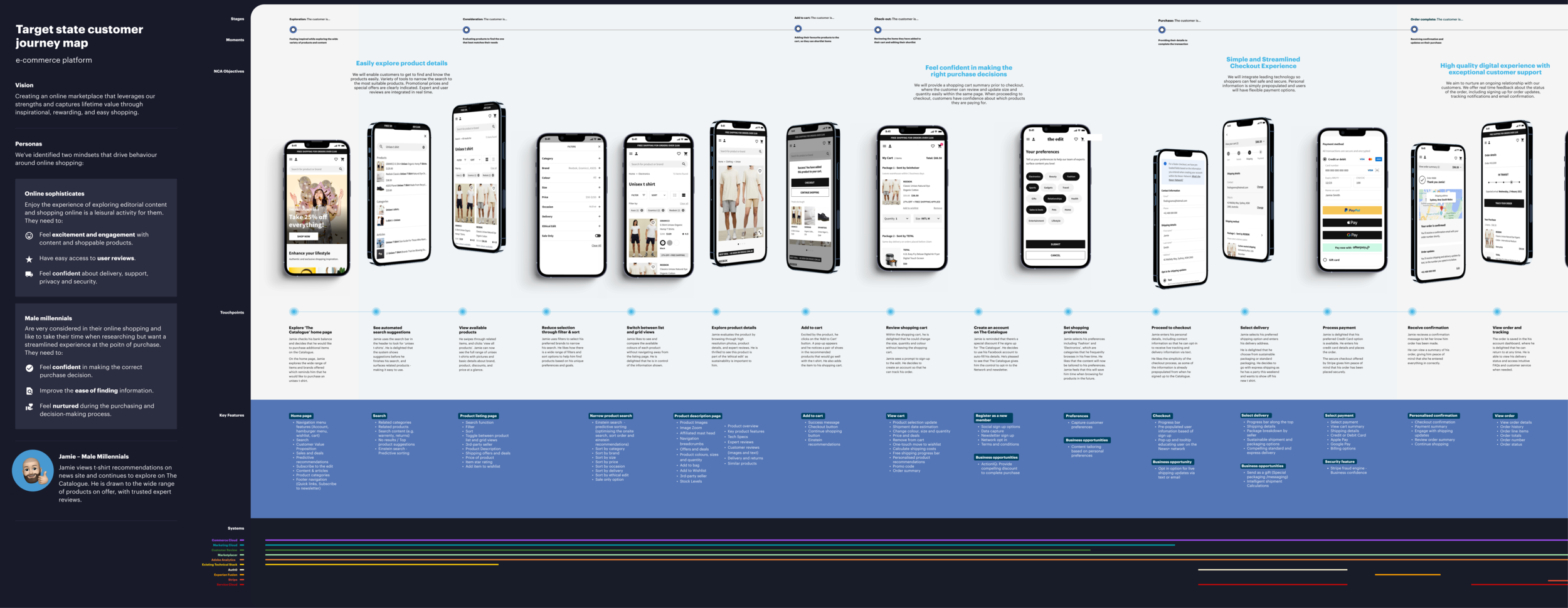
Customer Journey Map
While we were busy designing, business analysts, developers and brand strategists were also working hard to bring this project to reality. We realised quickly that no one will succeed unless we all do.
I led the creation of the service design blueprint, which brought teams together to talk about sticky problems and agree on the target customer journey.
I believe that good design should be like plasma
Bringing together different teams to align and work towards the same outcome through visual communication.
Key Learnings & Reflection
This project had multiple streams of work, which had brand, design, developers, business analysts all running in parallel to create this totally new platform.
There were clear dependencies and blockers that were not clearly defined at the beginning of the program, and it created quite a lot of realignment. I learned the importance from day 1 to define dependencies and continue communicating between teams.
From a design perspective, this meant:
Upstream: Staying in the loop with branding decisions, to design flexible solutions while design direction wasn’t yet clear.
Downstream: Considering feasibility based off the timeline and tech stack that we had, and designing solutions that could be built and shipped by the dev team by the release date.
